Since the challenge is now finished, I am finally sharing this at link parties! Voting is open until the end of April on Ricochet and Away
The moment I heard about the Typography Challenge, run by Keren (sew la vie) and Rikka (Ricochet and Away), I signed right up!
The lovely ladies hosted the Naughty Notions Challenge back in January, for which I made a zip-covered clutch bag.
This time around, the goal of the challenge is to create a home décor piece that incorporates typography. 'Great!' I thought, full of ideas.
Then I hit another craft slump and didn’t feel like making anything.
Luckily, some spring weather and a little easy-peasy crafting gave me the boost I needed to crack on with my project!
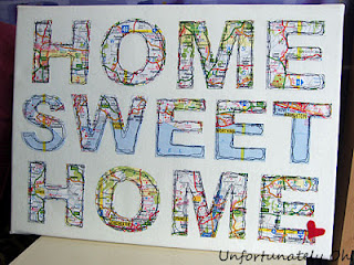
For this challenge, I decided on wall decor using maps.
Here’s what I put together:
Before starting on this, I was torn between a canvas and a quilted wall hanging. I decided upon a canvas since wall hangings remind me too much of secondary school, where student-sewn squares were quilted together into banners for the stairwells!
This project cost me a grand total of 99p--and that was the cost of the canvas I bought from The 99p Store.
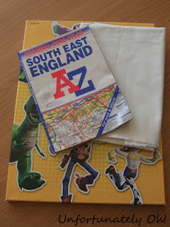
The fabric was an off-cut from my stash and the old map book I used was destined for the recycle bin.
I completed this across a couple of days! Read on to find out about the creation process, and the little lumps and bumps that happened along the way.
The canvas I bought to use as a base was pretty ugly and showed through the fabric, so I tried painting over it...
It didn’t work, even after a few coats, so I pulled the canvas picture off entirely. Sorry Woody and Co, I don’t want you showing through my work!
Usually I’d have bought a plain canvas from the 99p store, but the only two left on the shelf were heavily damaged. Also, the picture canvas was bigger :)
After measuring the canvas, I went onto the computer and created a new document of that size in Photoshop Elements. I chose a font and wrote out my chosen words (Home Sweet Home, of course!) then played around with it until it looked as I wanted.
Obviously I only needed to print off one ‘HOME’ plus ‘SWET’ (I made the ‘sweet’ in a smaller font size) so I messed around with that too and once I was ready, I’d got my print job down to 1 1/3 pages!
I don’t have any nifty electronic cutting machines so I did all the cutting with my nifty 99p store cutting set!
The cutting out took ages, using a cutting mat from a guillotine kit and a ruler.
...I really need a decent cutting mat!
Once my stencils were cut out, I traced the letters onto pages of the map, and cut them out with a ruler and craft knife.
I cut a piece of fabric to fit around the canvas frame (and ended up cutting another to go underneath, since the frame showed through despite the fabric being fairly thick).
Then I used a ruler and tape measure to lay out the letters evenly, and stuck the letters to the fabric using Pritt Stick.
The glue is only there to hold the letters in place for sewing. I’ve learnt from experience that sewing machines don’t tend to like sewing through lots of glue!
Since there were pencil marks on the letters (I didn’t trace all too tidily!) I used a putty rubber to remove them. Putty rubbers are great because they get the marks off but don’t make any mess!
I wanted to free-motion the letters onto the fabric. Most of the tutorials on free-motion embroidery say to lower the feed dog of the sewing machine. My machine doesn’t have any of those functions, but I found an awesome post on A Few Scraps, which explains a few feed dog options!
When I tried free-motion before to decorate a sewing machine cover I had a few issues with the method I used (covering the feed dogs with the plastic thing that came with the machine for sewing buttons). It left too little space under the foot of the machine.
The blog linked above suggested covering the feed dogs with a piece of card. It worked great!
I sewed around each letter three times. The letters with straight lines were pretty easy to sew, though I had trouble with the S and the Os. Just as well I was going for a scrappy look!
If you try this at home, take care not to sew stitches too closely. It can perforate and/or rip the paper! It's obvious, but I didn't think about it until it happened to me (luckily only on a test run!)
As a finishing touch, I cut out a little felt heart and glued it to the end of the last E, like a little place-marker.
I then stapled the fabric to the frame. For the corners, I cut tall triangles, the width being the depth of the frame, and folded them in before folding the edges over. It helped to hide the corner of the frame and saved me having bulky areas. I trimmed around the fabric with pinking shears to prevent fraying.
Having raided Dad’s garage for picture hanging things (picture hooks?) I screwed them into the back of the frame, and knotted on some string for hanging.
After all of that, I was finished!
If you want to enter the Typography challenge, it’s not too late! The deadline for submissions is the end of the month--so sign up and get crafting! :)
Edit: The Typography challenge is over now, but that means that voting is now open! Click the button below to check out all the fantastic submissions, vote for your favourite, and leave some love to the lovely challenge hostesses!
Linking up at the parties at the bottom of the page!


Excellent Kei! Very cool!
ReplyDeleteIt's brilliant!
ReplyDeleteI love it!
cool! adding a black frame, for me, would be the best! :):) kisses!
ReplyDeleteI love the quilted effect on each letter. Great idea. Glad you got your craft back on. :)
ReplyDeleteLOVE LOVE LOVE!
ReplyDeleteBeautiful work! I love the black "uneven" stitching on each letter, and the little felt heart!
ReplyDeleteGreat work, very decorative :)
ReplyDeleteAwesome!!! I love it!!! The free motion stitching really looks fabulous on the map letters. Hope you don't mind, but I'm pinning this one. It might never happen, but I'd love to make one.
ReplyDeleteThis is beautiful :D I love it!
ReplyDeleteFantastic Kei, I love love love it!!
ReplyDeleteI absolutely love this...what a fab idea... it is one of my two favourites from the Topography challenge. Pinning this for future inspiration … off to place my vote.
ReplyDeleteThis is fantastic! I love that it's paper and fabric together :) Your comment about wall hangings reminding you of highschool made me laugh because that's exactly the decor they had hanging up at my school when I attended!
ReplyDeleteClaire @ alittlesomethinginthemeantime.blogspot.com
This is suppeerrrrr cute! I love maps so I'm lovin' this a lot! Thanks for sharing it! Found you via Flamingo Toes link party :)
ReplyDelete-Bonnie @ Revolutionaries
www.revolutionariesblog.com
Wow! THat is just amazing! I love it and it really looks like you put a lot in to it! What a great idea. Saw you at The Blackberry Vine. Great job!
ReplyDeleteThis is to stinking cute. What a great job. I would love it if you showed it off at my new linky party @ Kampenlane.com.
ReplyDeleteI can't wait to see what else you create.
~Taylor
Oh, WOW! That looks aMAzing! What a great idea! Thanks for sharing such fun inspiration...I'd love for you to link it up here if you have a minute:
ReplyDeletehttp://oneartmama.blogspot.com/2012/04/shine-on-fridays-24-and-giveaway.html
Lovely!
ReplyDelete